Sunwink is a forward-thinking beverage company that is committed to creating a brighter future for beverages. They offer a range of plant-powered, sparkling, superfood tonics and superfood powders that are all organic, vegan, and non-GMO. Sunwink believes that everyone deserves to feel good, and that starts with what we put into our bodies. Their mission is to offer beverages that not only taste great, but also provide the body with the nourishment it needs to thrive.
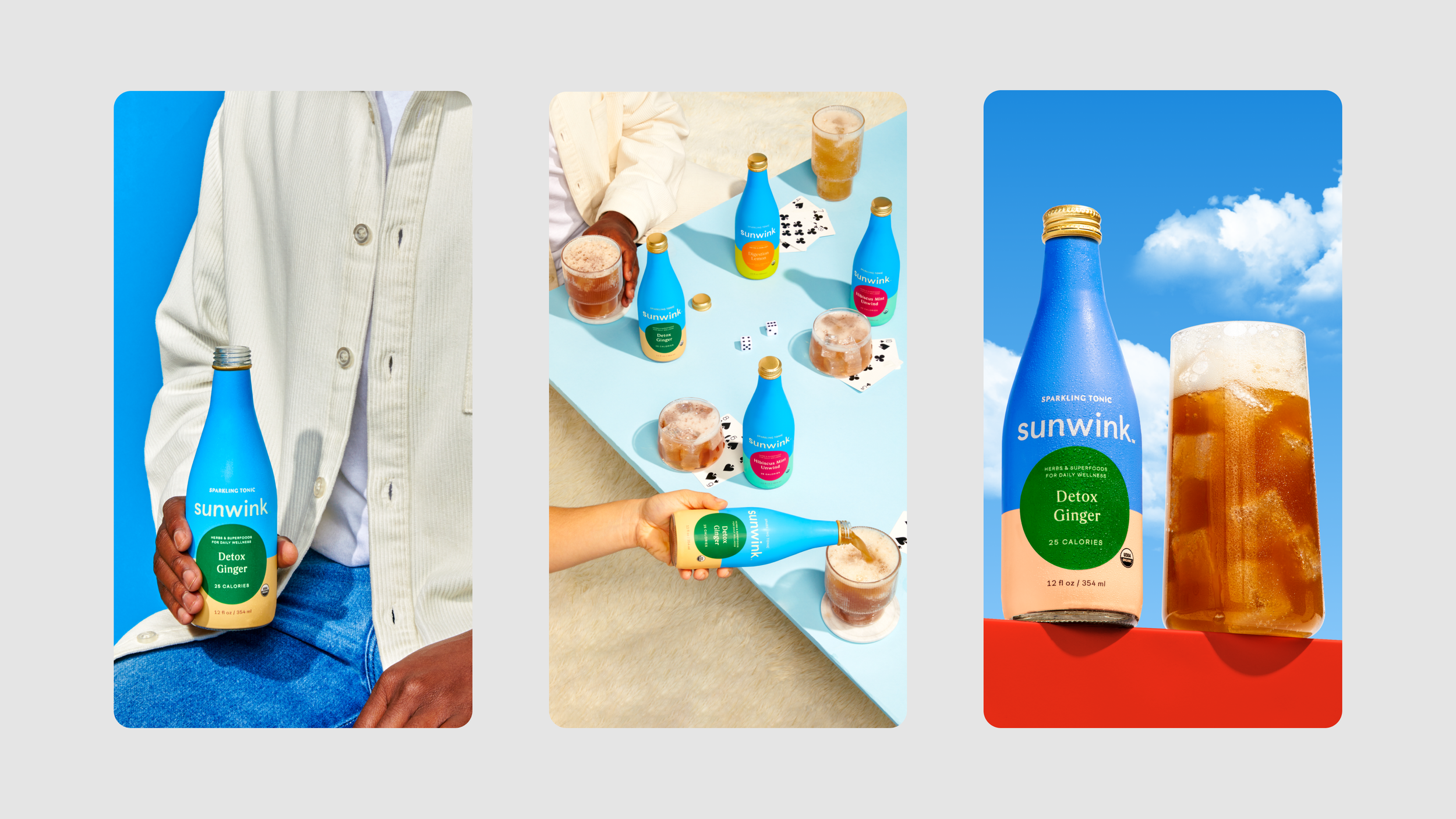
As the Designer and Art Director at Sunwink, one of my key responsibilities was designing the packaging for Sunwink's range of tonics and powders. The packaging design was essential to help the products stand out on the shelves, convey the brand's values and mission, and appeal to Sunwink's target audience. To begin the packaging design process, I worked closely with the Sunwink team to define the brand's core values and identify the key elements that would make each product unique. From there, I developed a visual style that would be consistent across all products, while still allowing for individual flavor profiles to shine through. One of the most important aspects of the packaging design was the use of color. We wanted to create a cohesive color palette that would help Sunwink's products stand out on the shelves, while also conveying a sense of natural vibrancy and energy. We chose bright and bold colors inspired by nature, such as deep greens, sunny yellows, and vibrant pinks and purples.
Another important element of the packaging design was the use of typography. We chose a font that was clean, modern, and easy to read, but also conveyed a sense of natural elegance and sophistication. We also included eye-catching product names and descriptors that would help consumers understand the unique benefits of each product.
ART DIRECTION, PACKAGING DESIGN, 3D MODELING